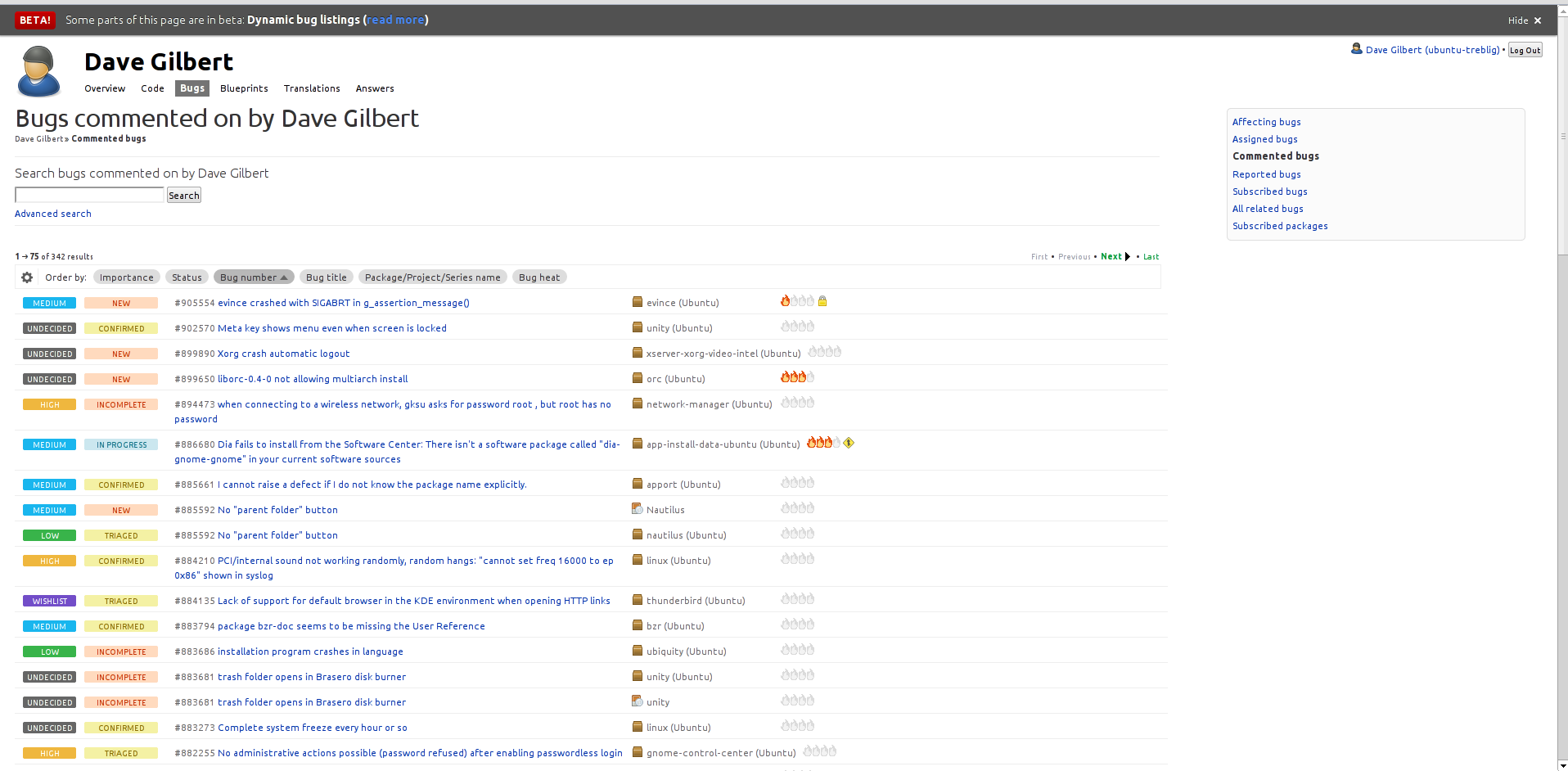
Dynamic bug listings are too sparse
Bug #894442 reported by
Soren Hansen
This bug affects 13 people
| Affects | Status | Importance | Assigned to | Milestone | |
|---|---|---|---|---|---|
| Launchpad itself |
Fix Released
|
High
|
Huw Wilkins | ||
Bug Description
I do enjoy the customisability offered by this new feature:
http://
...but I'm not a fan of the page layout. It wastes a *lot* of screen real estate. The multi-line-per-bug layout just makes navigating (i.e. scrolling) that page a major pain. I like to be able to see all the information on the page at once or with minimal scrolling. It takes me 10 rolls on my scroll wheel to make it from the top to the bottom of
https:/
That's just too much. Can you bring back the single-line-per-bug view, please? Pretty please?
Related branches
lp:~huwshimi/launchpad/single-line-bugs-894442
- Ian Booth (community): Approve (code)
-
Diff: 245 lines (+90/-79)5 files modifiedlib/canonical/launchpad/icing/css/colours.css (+27/-12)
lib/canonical/launchpad/icing/css/components/bug_listing.css (+56/-0)
lib/canonical/launchpad/icing/style.css (+5/-65)
lib/lp/app/browser/tales.py (+1/-1)
lib/lp/bugs/stories/bugtask-searches/xx-listing-basics.txt (+1/-1)
lp:~huwshimi/launchpad/inline-fields
- Curtis Hovey (community): Approve (code)
-
Diff: 168 lines (+55/-67)2 files modifiedlib/canonical/launchpad/icing/css/components/bug_listing.css (+11/-20)
lib/lp/bugs/templates/buglisting.mustache (+44/-47)
| tags: |
added: bug-columns removed: bug-columens |

| Changed in launchpad: | |
| status: | Confirmed → Triaged |
| importance: | Undecided → High |
| summary: |
- "Dynamic bug listings" is much too sparse + Dynamic bug listings is much too sparse |
| summary: |
- Dynamic bug listings is much too sparse + Dynamic bug listings are too sparse |
| tags: |
added: qa-ok removed: qa-needstesting |
| Changed in launchpad: | |
| status: | Fix Committed → Fix Released |
| tags: | removed: qa-ok |
| Changed in launchpad: | |
| status: | Fix Released → Fix Committed |
| Changed in launchpad: | |
| status: | Fix Committed → In Progress |
| Changed in launchpad: | |
| status: | In Progress → Fix Committed |
| tags: | added: qa-ok |
| Changed in launchpad: | |
| status: | Fix Committed → Fix Released |
To post a comment you must log in.
Status changed to 'Confirmed' because the bug affects multiple users.