
[1 new] Expansion: 'ẞ' LATIN CAPITAL LETTER SHARP S (U+1E9E)
| Affects | Status | Importance | Assigned to | Milestone | |
|---|---|---|---|---|---|
| fonts-ubuntu (Ubuntu) |
Confirmed
|
Low
|
Unassigned | ||
Bug Description
The German glyph LATIN CAPITAL LETTER SHARP S (U+1E9E) is not currently in the Ubuntu font. Other free fonts frequently used in open-source contexts like DejaVu or Linux Libertine as well as the fonts of other recent operating systems have it:
http://
http://
So it would be nice if the Ubuntu fonts have this character eventually.
Design proposals:
- https:/
- https:/
- https:/
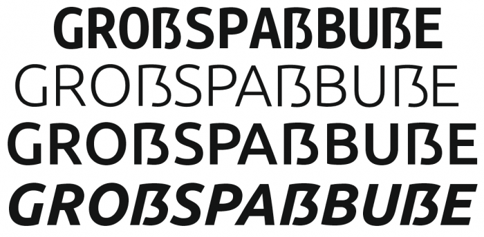
Unicode separates the characters into blocks, (covering Cyrillic, covering Devanagari and splitting Latin up into the Basics, Supplements, Latin Extended A, Latin Extended, B Extended, C ..., D..., and Extended Additional. These are the same cake splices that are being used to split up work on the Ubuntu Font Family. 'ẞ' lives in the Latin Extended Additional block, and at the moment work is focusing on Arabic and Hebrew (fonts take a _long_ time to develop and it's not possible to do everything at once at the beginning, so the build-out will be gradual).
On 29 June 2017, ẞ became an official part of the German alphabet.
Please could you get anyone who needs this glyph to click the "Affects me" button at the top, as this will help to gauge what priority to focus on for each block/script/
| Changed in ubuntu-font-family: | |
| milestone: | none → 1.00 |

| soc (simon-ochsenreither) wrote : | #1 |
| soc (simon-ochsenreither) wrote : | #2 |
Ooops. That should have been "Thanks!".
| tags: | added: uff-german uff-latin uff-latin-extended-additional |
| summary: |
- Glyph missing: LATIN CAPTIAL LETTER SHARP S (U+1E9E) + Expansion: LATIN CAPTIAL LETTER SHARP S (U+1E9E) |
| summary: |
- Expansion: LATIN CAPTIAL LETTER SHARP S (U+1E9E) + Expansion: 'ẞ' LATIN CAPTIAL LETTER SHARP S (U+1E9E) |
| Paul Sladen (sladen) wrote : Re: Expansion: 'ẞ' LATIN CAPTIAL LETTER SHARP S (U+1E9E) | #3 |
This falls in the "Latin Extended Additional" block, and at the moment the Ubuntu Font Family only has Latin A, and Latin B. I need to check when it is on the timetable to give you a better answer. When I hear back, it'll be attached to a milestone and you'll be able to keep track on it by that method.
| Changed in ubuntu-font-family: | |
| status: | New → Confirmed |
| importance: | Undecided → Low |
| Changed in ubuntu-font-family-sources (Ubuntu): | |
| status: | New → Invalid |
| Changed in ubuntu-font-family: | |
| milestone: | 1.00 → latin-e-a |
| description: | updated |
| Paul Sladen (sladen) wrote : | #4 |
Bruno talked about the "capital" ß and said that the Ubuntu Font Family would probably got for a composite ligature of "SS/SZ" for the codepoint, when expansion gets that far.
Speaking to various locals here is Germany, the "capital" has come about for titling (places like all-capital street signs) where a ß in the middle of a row of Latin capitals. but looks smaller and out-of-place (which is perhaps the reason why German street signs are lowercase except for the initial capital).
Various attempts have been made at the character using combinations of 'SZ' or 'SƷ', or upscaling the 'ſs' or 'ſz' origins. A separate "ß" seems to be preferred in these cases as a name containing SS "doesn't look right" and indeed, there can (apparently) be another name that is genuinely spelt 'ss'...
No good solution.
| Gerhard Großmann (gerhard-grossmann) wrote : | #5 |
To put a SS-ligature at the position which is indented by the Unicode Consortium to be filled with the letter Capital Sharp S ist wrong. You could write an opentype rule to substitute ß with SS in capitalised words but you shoudn’t missuse the place of a different symbole.
The capital Eszett (sharp s) isn’t really an often used letter. The majority of Germans don’t even know it exists since two years. But the general (and still valid) rule to replace it by SS causes some problems. If you capitalize words like “Maße” (metrics) and “Masse” (mass) they become identical (MASSE). With names it’s even more problematical: In my ID-Card my family name is spelled “GROßMANN” to make sure, it is not written “Grossmann”. But that’s orthographically as wrong as writing “BRUnO” or “PAuL” ‒ and it doesn’t please aesthetically, too. The capital Eszett provides an optimal solution.
So: Design a real capital Eszett or leave it completely ‒ but don’t fill the gap with the old problematical SS-substitution.
By the way: The substitution SZ is ‒ as far as I know ‒ only used by officials because this combination is (almost?) non-existent within natural German words. So it’s less likely to be missinterpreted but also much more strange if used in daily life.
| Bruno Maag (bruno-daltonmaag) wrote : | #6 |
IMO, the addition of the cap Eszettt was idiotic in the first place. It is typographically and grammatically incorrect. The eszett is a lowercase ligature made up of long-s and short-s and, really, is a historical character. In the past other languages, incl English and French used to use an Eszett but sensibly did away with it over time. Ideally, the Germans in the last reform of good grammar should have killed off this character, too. All they did was to 'simplify' the rules for the eszett but I think it's application has become even more arbitrary.
Since there is this Unicode point we ought to fill it. But I bluntly refuse to make a cap design of the Eszett for the simple reason that it is wrong. A double-S composite will do the trick. Yes, there is the potential of the word 'MASSE' as described above, but humans also take context into account when reading and I would suggest that most are quite capable to distinguish the meaning from one to another. Furthermore, capitalisation should happen at system/app level that automatically changes the eszett into SS when the appropriate command is given.
Incidentally, the Swiss have never applied the eszett and have managed to have a happy and continuous fruitful democracy for over 150 years. It is not missed at all in Switzerland.
| Denis Moyogo Jacquerye (moyogo) wrote : | #7 |
Not implementing U+1E9E ẞ as a capital letter sharp s is rather radical.
In Unicode U+1E9E ẞ has for lowercase U+00DF LATIN SMALL LETTER SHARP S
But U+00DF ß has no defined uppercase.
This means uppercasing strings like "Maße" will usually give "MAßE".
Some software might give a different uppercase (with SS, SZ, or ẞ), but that's their choice (it could be a locale preference or a user preference).
On the other hand U+1E9E ẞ has U+00DF ß defined as its lowercase, so lowercasing "MAẞE" will always give "Maße".
In orther words, people who don't want to use U+1E9E ẞ are not forced to.
Refusing to implement U+1E9E ẞ as a capital sharp s, does not protect people who don't want to use it, but it is preventing people who might want to use it with its defined purpose. That character won't change the way most people write in German, but it is greatly useful to people who wish to use it.
Why can't users be free to decide what's idiotic or incorrect. Obviously it made in Unicode, so not all the experts agree it is incorrect. The proposal to encode it in Unicode was made by DIN (the German Standardization organization), they surely know what they are doing.
Please read http://
| Bruno Maag (bruno-daltonmaag) wrote : | #8 |
Denis, I have no problems with people having freedom to decide what's right or wrong for them, as long as their actions do not affect the freedom of others. In the case of eszett, I believe that instead of adding a uppercase version, the Duden folks should have abandoned the lowercase eszett altogether and two generations along we could have finally rid ourselves of this glyph from the Unicode list. The truth is that most Germans do not apply the eszett correctly, particularly not since the last reform. Yes, the rules have been simplified, and most exceptions to these rules have been culled, but the application is still arbitrary, as mentioned above. I looked through the rationalisation but it is not convincing, and frankly, DIN doesn't always get it right, either. I also think the Unicode consortium was misguided to add it to the list. I am sure there are more worthy causes.
Typographically, the proposed design for this glyph is atrocious. It's a lowercase version drawn to cap proportions and has not historic rooting. It is a whorechild for which no amount of cosmetic application would bring an improvement. The historic examples that are shown in the rationalisation are feeble attempts by printers to enforce the eszett rule on cap only setting without any thought of how the eszett ever has come about. I can't think of any historic setting where a distinction was made between long- and short-s in cap setting. It's one design, that's it. So logic would follow, that in this instance a cap-eszett would be made up of two plain S designs.
| Malcolm Wooden (malcolm-daltonmaag) wrote : Re: [Bug 650498] Re: Expansion:'ẞ' LATIN CAPTIAL LETTER SHARP S (U+1E9E) | #9 |
The implementation of a Unicode position for this 'character' is quite
bizarre. Some time ago the Unicode Consortium announced that ligatures
of any script should no longer be given code points but should take
identification from the co-joining of the single characters.
The capital Eszett, if the font designer feels it's applicable, should
be supported via font features, as is the case with most other
ligatures. As there is now a codepoint that supports this character we
will no doubt put it in the font, but should it be a double-S composite
or a true designed cap Eszett?
I'm off now to make representation to the Unicode Consortium for
codepoints of FF, FI, FL, FFI and FFL. :-)
--
Malcolm Wooden, Font Production, Dalton Maag Ltd
Direct Dial +44 20 8166 1285
Unit 107, 245A Coldharbour Lane, London, SW9 8RR, UK
A new contemporary serif font family: http://
Registered office: Mutfords, Hare Street, Buntingford, SG9 0ED, UK
Registered in England and Wales: 3103619
| Denis Moyogo Jacquerye (moyogo) wrote : Re: Expansion: 'ẞ' LATIN CAPTIAL LETTER SHARP S (U+1E9E) | #10 |
You might as well not fill in the codepoint.
The whole point of LATIN CAPTIAL LETTER SHARP S (U+1E9E) is that some people don't consider eszett as a pure ligature of long-s and s, but rather as something special that stemmed from that ligature.
The fact that "Maße" and "Masse" are two different words shows it's not a regular ligature like ff, fi, fl, ffi or ffl, because those don't change meaning of words, whereas ß does.
People who want to use U+1E9E, do so to avoid ambiguity. Having a double S instead, will be no use to them.
People who don't want a capital letter sharp won't be affected either way.
| soc (simon-ochsenreither) wrote : | #11 |
The sharp s is a character, NOT A LIGATURE!
A ligature is a typographical refinement to improve the appearance of two letters appearing next to each other.
The most important aspect of a ligature is that it doesn't change the meaning of words.
Yes, the sharp s WAS a ligature once. But w was once a ligature too. Should we therefore decide to remove W and write VV again instead?
If people could just stop repeating the same non-sense over and over again and actually start checking the facts?
The upper-case substitution of ß with SS was _never_ meant to be a permanent solution, it was something we call a "workaround" today, because it is exactly that.
PS: Could we just leave out that ß-hating here? It has nothing to do with that particular topic here?
| Paul Sladen (sladen) wrote : | #12 |
My understanding is that pre-reform there were the two transformations (Große Duden, Sixteen ed., East Germany, 1969); SZ being used instead of SS where there was ambiguous or conflicting word in the case of capitalisation; eg:
Busse→BUSSE
Buße→BUSZE
Post reform, the /transform/ is based on availability of the ß, and if not, the word should be transformed ß→ss or ß→SS:
http://
Paragraph 25, Explanation 3 (PDF page 27)
Note that the wording of §25E2 is that "if ß is not available, write ss". And since the current alphabet has 30 lowercase and 29 uppercase (Rules; Section 1.A.0 (PDF page 13)), this is what in-turn leads to the §25E3 explanation (current ß is /always/ not available in uppercase).
...So, not having an "uppercase" eszett /was/ the blocker for its further inclusion into the orthography (now been "fixed"). Ultimately, to quote a German I was talking to yesterday, "if RdR [now] add it to the orthography, that's what will be taught in the nursery schools". If a ẞ gets added to the alphabet, the existing rules still stay in place, but the glyph is now "available" and the transformation is not necessary.
For comparision: we could probably discuss at great length whether ₹ is a contrived ligature without historical basis (of Rर) . There are probably also cases where (for personal reasons) some of us individually might wish to restrict the use our work for particular ends or means (not designing nuclear weapons). At the end of the day, it is not for us to pass judgement on how others wish to use our work, just to ensure that /if/ somebody really, really wants to do something—be it going through an international standards body, or checking in with Dignitas—that we pragmatically /give/ them the best possible experience in performing that endeavour, even if we do not personally agree with the decision, or there motivations behind it in the specific instance.
| tags: | added: uff-unicode-5.1 |
| Bruno Maag (bruno-daltonmaag) wrote : | #13 |
soc says: PS: Could we just leave out that ß-hating here? It has nothing to do with that particular topic here?
I think it has very much to do with the topic at hand. It is about quality. As much as some people argue that a specific cap eszett should be designed we should equally consider the opposite view, not just simply adhere because some bureaucrats have decided, in their infinite wisdom, that it is now a good idea to have an uppercase version of a glyph. If Galilei would have simply agreed to the churche's wisdom ships would still fall off the edge of the world today. Unfortunately, we are lumbered with the cap-eszett Unicode point and we eventually have to fill it. That does not mean we should put a crap design into it.
I stand by my assertion that eszett is a ligature in the knowledge that Tschichold and other typographers agree with me. In addition the meaning of the words 'Busse' and 'Buße' or 'Masse/Maße' is not defined by the s-sound but by the pronunciation of the preceeding vowel (short/long). The preceeding vowel dictates the usage of eszett, except where the eszett is at the end of a syllable (or have they changed that now?).
| David Marshall (dave-daltonmaag) wrote : Re: [Bug 650498] Re: Expansion:'ẞ' LATIN CAPTIAL LETTER SHARP S (U+1E9E) | #14 |
Unicode's guidance on U+1E9E reads "capital sharp s is intended for
typographical representations of signage and uppercase titles, and
other environments where users require the sharp s to be preserved in
uppercase. Overall, such usage is rare. In contrast, standard German
orthography uses the string "SS" as uppercase mapping for small sharp
s. Thus, with the default Unicode casing operations, capital sharp s
will lowercase to small sharp s, but not the reverse: small sharp s
uppercases to "SS". In those instances where the reverse casing
operation is needed, a tailored operation would be required."
In other words, it exists solely to solve a very specific problem
where the irresistible force of all-caps setting meets the immovable
object of German orthography.
However, there is no rational reason or justification for U+1E9E to
adhere to the sloppy, ugly, and distorted capital version of "ß", any
more than a capital "A" should look like an enlarged "a". I would
suggest that as there is no consensus as to what this character should
look like, we seek a better solution - I would suggest a neat "SS"
ligature, which both makes the intention clear and doesn't
intentionally disrespect 500 years of German orthography and
typography.
Dave
| soc (simon-ochsenreither) wrote : Re: Expansion: 'ẞ' LATIN CAPTIAL LETTER SHARP S (U+1E9E) | #15 |
First I want to apologize to everyone in this thread if he or she felt I worded my arguments in a too confrontational way. Denis' and Paul's comments are good examples of staying calm, a behavior which I should try to achieve next time.
Dear Bruno,
I also have strong feelings about language, type design and its quality, as you may have experienced.
First of all I think calling your colleagues who proposed the Versaleszett to the Unicode consortium, validated its origins and history and invested a lot of time and work to improve the current situation "bureaucrats" is not helpful, but it is not my right or duty to judge about that.
Additionally I disagree with your point about "agreement to wisdom". Currently it is "wisdom" that "a capital eszett does not exist", despite obvious, valid and verified proof of the exact opposite situation for at least 130 years.
I really don't want to argue about the usage of the ß or the particular (maybe ambiguous) spelling of a fairly limited number of German words.
In my humble opinion, everyone on that thread is not that far away with his position than it seems.
We all care deeply about quality and one thing we surely all hate is the mixing of upper-case and lower-case letters.
Having a capital ß is not about trying to change rules or telling people how they have to write. Neither there is an agenda to increase (nor decrease) the usage of that small letter you dislike so much (for reasons I disagree, but I try to respect your point of view).
The main benefit of having a Versaleszett is something we might all agree about:
To provide an acceptable alternative to mixing lower-case and upper-case letters, where neither the substitution of ß with SS nor other workarounds are feasible. (Of course people should learn that WRITING IN CAPS is a thing which should probably reduced to an absolute minimum.)
Eventually I want to clarify that probable no one who disagrees with you considers to burn you on a stake, like that institution you took for comparison did, so I fell a insulted and sad about your wording.
I hope - and I will try my best - that we can have a more friendly and respectful discussion here in the future, that we can agree to disagree and still try our best to find the best technical solution for that issue, regardless if an individual person likes or dislikes the idea.
I really hope that you are not too angry about the whole thread here and would be happy if you and your team could still try to come up with the best design for the Versaleszett possible.
Thanks!
| Paul Sladen (sladen) wrote : | #16 |
David: What you propose is sensible; although I believe that a treatment of ß and SS will differ significantly in width. We're aiming for long-term metrics stability of included coverage between major releases, so while we can update glyph and hinting data it is going to be very hard work to provide a pleasing ß stretched up to the bounding box providing by initially include SS, if it turns out to be needed later.
I cannot predict how the German language will involve within the next decade (but the hints are there in the wording of the rules and the Unicode track being taken) and, if RdR do indeed include a 30th capital letter in the language and, if the Germanic governments ratify such a revision of the orthography and, if then perhaps further, it is taught in schools and children have the requirement to see on-screen all 30 lowercase and all 30 uppercase, _then_ we would not be able to meet that requirement. We would need to break metrics in order to close up the width and break our own published intention of stability.
The risk from backing ourselves into this rather awkward corner are quite large and so in preference it might be better to ship a missing entry for the medium-, or long-term at that codepoint (this would allow substitution from other fonts to occur), ensuring that various articles trying to discuss the subject matter do at least display in a sensible fashion:
http://
http://
| soc (simon-ochsenreither) wrote : | #17 |
Hi David,
although I prefer a more distinct appearance of the Versaleszett to two S combined, I would love to be able to see the ideas you prefer.
It is important that this letter fits naturally into the font, so I'm interested if it can be done in an aesthetically pleasing way.
Judging from Signa 9 many font creators had the idea of somehow combining multiple S, S and Z, S and an inverted 3, S with a dot, S with a cedille, ...
But it seems that those designs never got the traction like the "capital version of ß".
The two basic designs which were quite common in the last decades (Versaleszett with rounded top-left stroke/without rounded top-left stroke) seem to be a compromise between legibility (they are intentionally supposed to look like a ß) and an adaption to fit with other upper-case letters.
So while the design is not set in stone, I would love to see different designs and approaches to think and discuss about.
Thanks!
| Bruno Maag (bruno-daltonmaag) wrote : | #18 |
soc, please don't take my arguments as a personal affront.Like yourself, I have a strong opinion about this glyph - and I guess being Swiss doesn't help, since we would prefer to put this character into a parallel universe and then close the space-time rift forever.
As I can't do much about the Unicode inclusion of the cap Eszett other than maybe go to a conference one day and start petitioning for the reversal of that decision, I am aware that we have to come to a solution. My primary objection is to creating a capitalised version of this ligature (note the wording! ;-) ). My feeling still is that it should simply be a double-S composite but I am happy to spend some time to create a ligature that, as David explains, makes the intention of the glyph clear without resorting to something utterly ugly.
I remember that at the time of the Unicode inclusion a heated debate was raging on typophile. Opinions are wholeheartedly divided on this issue. You write: 'Additionally I disagree with your point about "agreement to wisdom". Currently it is "wisdom" that "a capital eszett does not exist", despite obvious, valid and verified proof of the exact opposite situation for at least 130 years.' Naturally, our colleagues at DIN needed to have examples to justify the capitalised design of the Eszett but I am not convinced that the examples that are shown in the rationale are not created from ignorance about typography and grammar. Interestingly, it's only been 130 years that this treatment exists whilst the use of long- and short-s can be traced much further back including the ligaturised version of eszett. Is that not an indicator that these printers were misguided and overzealous? I am not saying, I am asking.
Clearly, I am glad that no-one wants to burn me for my opinions but then again, I have no intention to do so either. Again, my wording has come out of passion for what I do and I simply want to state that just because some so called authoritative orgnaisation mandates something that we should not necessarily take it for gospel. Since we started work on the Ubuntu font project about six or seven months ago it has grown on me beyond just being another type design. I think we have truly created something exciting and continue to create exciting stuff. Working with the opensource community has been a very steep learning curve and keeps doing so. I want to make sure that whatever comes next maintains the highest standards of design and technical implementation whether they are Latin glyphs or Church Glagolithic. You can be sure that there will be many more such terse exchanges. :-)
So, soc, I totally agree that we all want the same thing - an agreeable solution for this arguably good or bad situation. Clearly, I need to put my words to action and start designing. And at no time, I felt insulted or aggravated by you. This is just part and parcel of debate and arguement. And occasionally tempers flare but history proves that often the best things have come out of heated debate.
| David Marshall (dave-daltonmaag) wrote : Re: [Bug 650498] Re: Expansion:'ẞ' LATIN CAPTIAL LETTER SHARP S (U+1E9E) | #19 |
You're right - we have no idea what diktats we're going to comply with
over the next decade, or how they will impact on the fonts and various
scripts. So, while we should constantly strive to keep the metrics
stable, I have no doubt that we will be forced to make changes to them -
either to fix a major bug, or because of external forces. Given that at
the moment "no-one knows" what the capital sharp s should look like, I
think we have the liberty to solve the problem ourselves with something
elegant, clean, and clear.
However, the width constraint point still stands as we need to have a
monospace capital sharp s. I'm sure there's a good design solution there
somewhere though.
Dave
| David Marshall (dave-daltonmaag) wrote : | #20 |
I'm not a designer, so I too am interested to see if it can be done in
an aesthetically pleasing way. :)
My view is that a good solution needs to not only fit the design of the
font, but also be immediately obvious to German readers as to what it
is, why it exists, and why we've done it.
The test I have in my head is a street sign ending in "straße", set
all-caps. If that works, and is clear to all who see it, we've solved
the problem.
Dave
| Paul Sladen (sladen) wrote : Re: Expansion: 'ẞ' LATIN CAPTIAL LETTER SHARP S (U+1E9E) | #21 |
Dave: Gravestones seem to be the other good test of acceptability, as these are normally written in uppercase.
| Paul Sladen (sladen) wrote : | #22 |
Note: for those interested, I spent an afternoon walking graveyards and visiting a stonemason in Germany before I left. The stonemason eventually got quite interested and demonstrated what they tend to do. Their workflow is mainly based upon compuer->paper plot->hand-held sand blaster.
If they're using the computer and the issue comes up, they tend to "make" such a glyph using a pair of letters 'I's and then a numerical '3', depending on what the family requests.
| Thorsten (kdefan) wrote : | #23 |
Bruno et al.,
Ubuntu needs a glyph at U+1E9E, simply for practical reasons. Feel free to skip to my last paragraph for those practical considerations. I'm also adding some context above that.
While it is understandable that speakers of Swiss German (some 5 million people) see little use for the ß, lower-case or otherwise, Austrians (8 million) and Germans (80 million) feel very differently about this. Eszett is simply not used in Switzerland, but it _is_ used in Austria and Germany. Now, in those areas where it has been used (over 90% of German-speaking areas), continuous use of an upper-case ẞ (albeit non-standardized until 2008) has been well documented since the 19th century, essentially right from the point when Germans started to use non-blackletter typefaces. The reasons for this are well known.
While the standard capitalization of ß has been–and will remain to be—SS, the resulting ambiguity is often to be found unacceptable, especially for proper nouns such as names of people and places. Legally and practically, Ms. Großmann and Mr. Grossmann have distinct given names. Therefore, Grossmann's name can not be set in all-caps without a capital ß. As an ugly, UGLY fallback, the name is now rendered in German passports and ID cards with a lower-case ß, i.e., GROßMANN. This affects all people who have an ß in their name—at least hundreds of thousands of people. None of them doubt the need for a capital ß—and the trouble and expense they go through to put customized capital eszetts on their tombstones is just one testament to that.
Place names present another challenge. Gießen, Meißen and Dessau-Roßlau cannot properly be rendered in all-caps without a capital ß. "Gießener Zeitung", a local newspaper first published less than three months (!) after Unicode formally adopted U+1E9E, has been using the capital ß in its nameplate (where GIEẞENER ZEITUNG is rendered in all caps) from the start. Bottom line, Germans do use the capital ß and are not going to stop, whether Bruno likes it or not. ;-)
(Also, Ubuntu rightfully encoded the Indian rupee sign, before it has had a chance to be widely used within India. What's so different about the capital ẞ, which is codified by Unicode and officially sanctioned by the German government?)
But here is the practical consideration: since the glyph is going to be used, people are going to use it on computers, incl. those running Ubuntu. Without a glyph at U+1E9E the Ubuntu typeface, the system WILL pick and display one from the fall-back font. On most systems, that would be DejaVu Sans, whose capital ẞ isn't very pretty to begin with and doesn't match Ubuntu's capitals. Bruno, other Swiss, and even a few traditionalist Germans (without ß in their names or cities) might think that a capital ẞ is unnecessary, stupid, and ugly, but a default interface font that renders a hodgepodge of Ubuntu capitals and the DejaVu Sans ẞ would be doubly ugly. Including a glyph at U+1E9E would change NOTHING for the Swiss and others, on the other hand. The default capitalization of ß would and should continue to be SS, as prescribed by all standards, German and international.
| Thorsten (kdefan) wrote : | #24 |
| David Marshall (dave-daltonmaag) wrote : Re: [Bug 650498] Re: Expansion:'ẞ' LATIN CAPTIAL LETTER SHARP S (U+1E9E) | #25 |
I think we're agreed that we should have *something* in that slot, but
not agreed that it necessarily be a strange and distorted "big" version
of ß. There is no harm in searching for a solution that's clear,
understood, sympathetic, and elegant.
I'm not a German speaker and even I find the proposed capital shape
preposterous. There must be a better solution.
Dave
| Gerhard Großmann (gerhard-grossmann) wrote : Re: Expansion: 'ẞ' LATIN CAPTIAL LETTER SHARP S (U+1E9E) | #26 |
Yes, there has to be something in that slot, David. But I can’t support your antipathy against the proposed form of the capital ß. It’s definetely not “a strange and distorted ‘big’ version of ß”. Maybe you judge it as a wired form BECAUSE you aren’t German speaker an aren’t used to it. Think åbout lettérş of oŧher lænǥűageƨ. If you don’t see them in evǝrydɐy textƶ, the appear literally as a foreign partiçles. The best thing a font can do is to design them carefully so that they fit into the font.
A nice PDF about the “construction” of ẞ is http://
I love the ẞ and I am very proud of having the special letter ß in my language. I’m also happy to have the capital ß as a possibility to make my capitalized family name really non-ambiguous. Please respect the Eigenwilligkeiten (~individualities, originalities) of non-Englisch languages and don’t try to “fix” them.
I hope this post wasn’t to emotionally, but to vilify the ẞ isn’t also very objective.
| David Marshall (dave-daltonmaag) wrote : Re: [Bug 650498] Re: Expansion:'ẞ' LATIN CAPTIAL LETTER SHARP S (U+1E9E) | #27 |
To be clear, I absolutely respect typographic diversity, and certainly
don't regard ß as a foreign particle. However, I also have respect for
the necessity, diversity, and history of ß, which is why I don't find
the Dresdner Form of the capital visually acceptable.
ß is a simple and elegant joining of a long s and a short s. To
"construct" a capital version which randomly borrows completely
unrelated features from upside down versions of other uppercase
characters to make something structurally similar to a ß is illogical,
and hardly simple or elegant; any capital version of ß should be firmly
grounded in the features of the S.
I am fairly sure that we can find an acceptable, elegant, and
transparent solution. And if we can't, at least we tried.
Dave
| Thorsten (kdefan) wrote : Re: Expansion: 'ẞ' LATIN CAPTIAL LETTER SHARP S (U+1E9E) | #28 |
This discussion went on for several years in Germany (and, to a limited extent, in typography circles beyond). Virtually all imaginable alternatives were discussed, incl., but not limited to, ligatures of capital letters (SS or SZ), S or Z reversed, S or Z with diacritical marks. All were ultimately rejected for a number of reasons, not the least of which was that such a radical redesign would represent a break with at least 130 years of precedent (which can be observed at virtually every German cemetery).
David is right, of course: an ß that is simply enlarged to match the dimensions of capital letters looks just wrong. That does not mean, however, that it is impossible to design a proper capital letter that is beautiful, fits in well among its capital brethren, AND respects over a century of history. Furthermore, not all ẞ glyphs have to look exactly alike. Font designers have come up with quite a variety of shapes fitting the characteristics of their typefaces, while remaining easily recognizable.
Bauhaus University in Jena recently commissioned a capital ẞ for its CD typeface, Linotype Syntax. **BAUHAUS** University!
http://
Who thinks that THAT ẞ is preposterous?
More examples (many beautiful, some perhaps less so, but few or none that really stick out like the proverbial thumb) can be seen at http://
| Ralf H. (ralf-seite7) wrote : | #29 |
Why do you need something in that slot? Because people use that codepoint.
Ho does it has to look like? Thorsten already has some good links. I want to add:
http://
http://
Bruno, please try to forget your (type) history. Some characters evolved, some are pure inventions, some are in between. They are abstract images and stand for themselves and their meaning, never for their history in the first place and therefore cannot be "right" or "wrong" by definition. Take the German Ü/Ä/Ö: They evolved from a lowercase (!) combination of u, e, a with the character e. An uppercase version was needed and so we naturally ended up with Ä/Ö/Ü. Everyone is happy with that, even though according to your definition they would be "wrong", because historically someone placed a lowercase Kurrent e on top of an uppercase letter. Creating an uppercase ß is exactly the same thing. It's neither right or wrong, it just fills a gap.
So, the design of the capital sharp s doesn't have to fulfill any historic requirements. It just needs to work! What works has been discussed for some time now and the direction most type designers go is pretty clearly visible from looking at the provided examples. So please don't try to invent some new and fancy SS ligature or something like that and go with what we have agreed on in the last couple of years. Because that's what letters and language are in the first place: agreements, that one abstract thing (a glyph or a word) stands for a certain meaning.
| Denis Moyogo Jacquerye (moyogo) wrote : Re: [Bug 650498] Re: Expansion: 'ẞ' LATIN CAPTIAL LETTER SHARP S (U+1E9E) | #30 |
Why is uppercase being based on larger lowercase is so problematic?
It is common in many language's orthographies, and although not
traditional or "normal" for some of us, it has been for many people
for a while.
Look at the n shaped Eng (Ŋ) used in Africa vs the N shaped on use in
Scandinavia, the Azeri schwa or African turned E (Ə) vs. the other
turned E (Ǝ), the n shaped N with long right leg (Ƞ) used in Lakota,
the Latin alpha (ɑ/Ɑ) used in Africa, the r with tail (ɽ) shaped
capital R with tail (Ɽ) vs. that capital R shaped, and other
historical letters. Are these so problematic they will require a new
design? Some of these have been around for less time than the
uppercase eszett.
| Bruno Maag (bruno-daltonmaag) wrote : Re: Expansion: 'ẞ' LATIN CAPTIAL LETTER SHARP S (U+1E9E) | #31 |
In many instances new letters were made up to represent a specific sound in a particular language that wasn't covered by the existing alphabet. The most obvious example are diacritics - which I would argue the R with tail is. Many of these characters came to life, particularly in Africa, during the 19th Century when missionaries roamed the continent and transliterated the native language into written form using the Latin alphabet. And they found themselves lacking in letters.
Not being designers they simply took what was there already and adapted it with fairly little regard to typographic history and sensitivity. The Eszett is such a case, too. No one could be bothered, back in the metal type days, to actually design a proper cap version - instead they simply used the lowercase form since it was there already. Unfortunately, when the glyph finally had an official status the lowercase form was already so impregnated in people's minds that it had become the defacto design without any regard to the structures of capital shapes v lowercases.
Regardless of my opinion of this character, I would suggest that we actually do have an opportunity here to design a 'real' form that matches the architecture of cap characters, not simply ape a shape that has sneaked its way in.
| Joshua Krämer (joshua-kraemer) wrote : | #32 |
Bruno Maag, you seem to be very badly informed.
To begin with, the German Eszett is *not* a ligature of long and short s. Such a ligature arose in the Italian humanist script, but it has nothing to do with the German Eszett. During the High German consonant shift, the germanic "t" partially became a sharply spoken "s" (compare English "eat" with German "essen"). In Old High German, this sound was written as "z", "zz", and later as "sz", which evolved into the letter ß, now no longer understood as a ligature (like w is no longer understood as a v-v-ligature). You can read more about the origin of the ß in Prof. Dr. Brekle's excellent article in the Gutenberg-Jahrbuch 2001, available online here:
http://
Tschicholds strange believings, which had no historic basis, are rebutted long ago.
Secondly, you're mistaken in believing that an upper case ß is unhistoric. The long s existed in the Semiuncialis even before the differentitation of upper and lower case existed!
I urge you to update your knowledge and reconsider your opinions.
| David Marshall (dave-daltonmaag) wrote : Re: [Bug 650498] Re: Expansion:'ẞ' LATIN CAPTIAL LETTER SHARP S (U+1E9E) | #33 |
I'm afraid you're not correct - the modern ß *is* a straightforward,
compact, and clear ligature of long-s, short-s.
The fact that at some stages through history words were spelt otherwise
(s-s, s-z, s-ezh) doesn't detract from the origin of the *current* shape
of the character.
Dave
| soc (simon-ochsenreither) wrote : Re: Expansion: 'ẞ' LATIN CAPTIAL LETTER SHARP S (U+1E9E) | #34 |
Well, trying to calm things abit down ...
Joshua is right when he says, that the ß today is no ligature, is not used as one and doesn't carry any of the specific meaning of a ligature (typographical enhancement, equivalence to decomposed character pair, etc.).
David is right when he says that common glyph design of the ß today originated from the typographical composition (= ligature!) of two glyps (ſ + s/z).
The current discussion about how the capital glyph represented today seems to divide people into two camps:
- Those who see the problem of people using lower case letters in a all-uppercase setting as the most important one seem to favor the approach of adjusting the lowercase letter to better fit with the other letters, mostly trying to preserve the characteristics of ß to make it as easy as possible for readers to understand from where this character comes from.
- Those who see the ß as an old-fashioned replacement for ss start from the original design of the two glyph pair two glyps (ſ + s/z) and look for a solution to supply U+1E9E with a good glyph.
I'm interested how both approaches work out and will love to comment on them even if I don't always share the same opinion with everyone here.
History seems to show that the designs of the first camp are generally preferred because they didn't evolve "re-educating readers", but I'm delighted seeing a design of the second approach capturing the essential meaning and semantic of an uppercase ß.
Bye,
Simon
| David Marshall (dave-daltonmaag) wrote : Re: [Bug 650498] Re: Expansion:'ẞ' LATIN CAPTIAL LETTER SHARP S (U+1E9E) | #35 |
Some people seem to be reading too much into my description of ß as a
ligature. A ligature is the joining of any two or more characters -
whether the joined setting can be sensibly decomposed into its
constituent parts or not. The ampersand, of example, is a ligature, but
no-one would suggest that it can be decomposed into e and t without its
meaning changing. Exactly the same applies to ß.
Dave
| Joshua Krämer (joshua-kraemer) wrote : Re: Expansion: 'ẞ' LATIN CAPTIAL LETTER SHARP S (U+1E9E) | #36 |
- poppelbaum.png Edit (1.4 KiB, image/png)
David Marshall:
Sorry, it's you who isn't correct.
In the 19th century, as in Germany more and more Antiqua was used, the need for a latin Eszett arose. There were many proposals and after live discussions in the "Journal für Buchdruckerkunst" in 1879, the "Typographische Gesellschaft Leipzig" recommended the form which Hartwig Poppelbaum proposed. In 1903, this form was again recommended by the annual meeting of the German, Austrian and Swiss printing house owners and afterwards obligatory accepted by a mixed commission. You can see Poppelbaum's s here:
| Joshua Krämer (joshua-kraemer) wrote : | #37 |
(Sorry for double-posting by accident.)
Poppelbaum's ß (you can see it in the graphic attached to my previous post) was official since its acceptance by the mixed commission.
It was only later, that some type designers began to use the form of an ſs ligature, believing Tschichold's wrong assertions.
Fortunately, not everyone was taken in, and if you search through MyFonts or a similar site, you will find many new typefaces using the historically correct form.
| David Marshall (dave-daltonmaag) wrote : Re: [Bug 650498] Re: Expansion:'ẞ' LATIN CAPTIAL LETTER SHARP S (U+1E9E) | #38 |
I'm not sure what you're arguing here. The 1903 Sulzbacher Form,
effectively a thorough romanization of ß, *is* intended to be derived
from a long-s+short-s ligature.
It's Fraktur forms which were almost invariably long-s+z or long-s+ezh
forms. It's on *this* point that Tschichold was flatly wrong -
attempting to retrofit long-s+short-s into a Fraktur structure - but
Fraktur is not the origin of the modern character.
The image you post of the Sulzbacher Form is very clearly a long-s
short-s ligature - absolutely no sign of a z or ezh, cursive or otherwise.
Today we do find glorious diversity in the design of ß, but the
Sulzbacher Form is the most common. If we were discussing the design of
a Fraktur face, we would be discussing long-s+ezh designs, but as we're
not, a Sulzbacher Form ß is the right choice for the Ubuntu font. Now,
back to the capital...
Dave
| Joshua Krämer (joshua-kraemer) wrote : Re: Expansion: 'ẞ' LATIN CAPTIAL LETTER SHARP S (U+1E9E) | #39 |
In the official announcement of the Commission in the "Zeitschrift für Deutschlands Buchdrucker" (1903, 9th of Juli), the form of the new Eszett is explained as follows:
"Das sogenannte lange Antiqua-ſ wird oben mit einem z verbunden, im Kopfe eingebogen und läuft im unteren Bogen in eine feine oder halbstarke Linie oder in einen Punkt aus […]"
Translation:
"The so called long Antiqua-ſ is connected with a z on its top, curved in in the head and ends in the lower curve as a fine or half thick line or a dot […]"
As you can see, the "Sulzbacher Form" was explicitely meant to be derived from ſ and z (ezh).
| David Marshall (dave-daltonmaag) wrote : Re: [Bug 650498] Re: Expansion:'ẞ' LATIN CAPTIAL LETTER SHARP S (U+1E9E) | #40 |
A very clear description, but it simply doesn't match the form they are
promoting. It conflates a z with an ezh - two completely different
shapes, and makes reference to features which simply aren't present. I'd
go as far as to say it's a explanation as fallacious as Tschichold's.
A long-s-ezh ligature would descend, is it does in the historic Fraktur
form, and would have a completely different junction at the top right,
again as in the Fraktur form.
To explain their preferred form as long-s-ezh requires as much
manipulation as Tschichold required to explain the Fraktur form as
long-s-short-s.
Where the text and exemplar diagram disagree, we must trust the diagram,
given the selection process that they went through to choose their
preferred form. And their exemplar is very clearly a long-s-short-s.
Dave
|
22 comments hidden
Loading more comments
|
view all 102 comments |
| Bruno Maag (bruno-daltonmaag) wrote : Re: Expansion: 'ẞ' LATIN CAPTIAL LETTER SHARP S (U+1E9E) | #63 |
It is a joy to see how much emotions can be stirred by something as seemingly insignificant like a letter design! Irrespective of which is the prefered version discussed currently, I feel that hardly any of these sit comfortably with the capital letterforms. My feeling is tha the reason is precisely because they are so closely based on the lowercase version. The only designs which have a cap feel and seem to gel into the design are in the fonts Old Standard, Calluna and M+.
I am not sure that sticking with either the Dresdner or Duden form is the right way forward to create a new character that sits harmoniously with the other caps but also has the right recognition factor.
| Gerhard Großmann (gerhard-grossmann) wrote : | #64 |
Thanks for your comparison, Denis! There you can see how poorly Microsoft (or ascender fonts?) designed their ẞ. It looks like you took the ß and put it between the capitals.
That’s what I meant with »differing from the capital version«, mach. ẞ and ß should be differ so much, that you can recognise which is which. You are also able to keep apart K an k or F and f. In Segoe or Verdana if you see ẞ or ß alone you wont be able to decide if its a capital or not. The primary requirement of course should be that the ẞ harmonizes with the other capitals.
| David Marshall (dave-daltonmaag) wrote : Re: [Bug 650498] Re: Expansion:'ẞ' LATIN CAPTIAL LETTER SHARP S (U+1E9E) | #65 |
Too many of these "solutions" stick out like a sore thumb - neither
retaining the rhythm of the capital strokes, not cohesively using the
features of the font. And then at the other end of the spectrum,
versions far too similar to a B to be clear. I do hope we're not hitting
an impasse.
Dave
| mach (j-mach-wust) wrote : Re: Expansion: 'ẞ' LATIN CAPTIAL LETTER SHARP S (U+1E9E) | #66 |
Gerhard Großmann, you are comparing the pair ẞ/ß to normal uppercase/lowercase pairs such as K/k or F/f. However, it is not, as can be seen both in the Unicode Standard and in the proposal to add it to the Unicode Standard ( http://
Here is a sheet with different proposals from Andreas Strötzner: http://
While many of these forms are obviously way off, there is a number of proposals that might work in one font or another (compare the diverse proposals for different fonts on Andreas Strötzner's site: http://
Note that Andreas Strötzner's 2004 proposal ( http://
The Ubuntu Font Family has a minimalistic appearance. I think it would harmonize best with something like the forms 3.g or 4.a of Andreas Strötzner's sheet. The playfull variance between straight lines, angles and rounded forms of 1.a, 1.b, 1.c seems less suited.
| Paul Sladen (sladen) wrote : | #67 |
The only place I've seen capital eszett used on its own ...is a tag for the Flickr group:
http://
Going through the Signographie archives, this article is of interest (in English):
Uppercase Sharp S Issues - by Dr Asmus Freytag
http://
The SIGNA9_
| Thorsten (kdefan) wrote : | #68 |
Bruno: if you like the ẞ glyphs in Old Standard, Calluna and M+, I’m sure we’re on the right track. :-)
I’m not so sure, on the other hand, how helpful the sometimes heated debates about ſS vs. ſʒ vs. ſ3 really are. These debates raged in Germany for years, the different sides dug in, but in the end, type designers found solutions that worked for their typefaces. While ideologues are interested in defending their respective points, type designers are interested in selling their commercial typefaces and seeing their free typefaces embraced. In other words, type creators appear to be motivated by what consumers of type expect — rather than what they *ought* to expect. Perhaps the pragmatic record established by type creators might be a better guide than prescriptive views.
Regarding the idea that widely used forms of the ẞ “stick out like a sore thumb”: would it be at all possible that this may be at least somewhat influenced by how much (or how little) a writer is used to reading German text in general? Trajan’s Column does not include a Þ, either. I’m sure many non-Icelanders might think of the first Þ they encounter as something that “sticks out”. Icelanders don’t seem to have this problem, though, and type designers who create typefaces for Western European languages usually yield to local expectations. Shouldn’t Austrians and Germans expect the same?
| Bruno Maag (bruno-daltonmaag) wrote : | #69 |
Thorsten - like is too strong a word. I would put it as 'accepting'. :-)
I agree that readers have expectations and that as a commercial type foundry I have to yield to such expectations to a certain degree. But at the same time it is our job as designers to improve a situation and I strongly believe that the current design proposal needs improvement. The design study by Andreas Stroetzner is interesting - some of the shapes I have investigated myself in my doodles for a decent cap Eszett (shudder! :-) ). IMO, the most interesting solutions in that document are the simplest ones such as the 'S' with a slash through. It uses a familiar glyph that represents the sound, and the slash denotes a different character, changing the soft 'S' sound to a strong, sharp one.
To return to the subject of familiarity, and thus legibility, there have been hundreds of studies in the past, and there will be hundreds of studies in the future. So far, there isn't a single one that with certainty says how we read and process written information. One thing is for certain, however - we read best what we are used to reading. Our grand-parents were perfectly fine reading Blackletter, whilst our kids (my teenage son) would be hard pressed deciphering a Blackletter text. I once did a small animation study replacing the vowels with unrelated symbols. Interestingly enough, legibility was only affected for a short time and quickly a sentence could be read with almost as little intereference as if there were the recognised vowel. But I digress...
| mach (j-mach-wust) wrote : | #70 |
Indeed: We read best what we are used to reading. That's why a barred S is unacceptable: It does not look like an ß at all. And that's also why I think the M+ shape is not a good choice: It is too different from an ß – "what is that strange B-ish letter?"
Bruno, you have said you didn't like certain forms of ẞ because they reminded you too much of ß. Why on earth should that be a bad thing? I don't get it. Is it a question of principles? I don't care for principles. The only reason why that strange new letter ẞ will be recognizable is precisely because it reminds of ß.
The Ubuntu ẞ must obviously be different from the Ubuntu ß because it needs a different height and, preferrably, a different width so that it fits in with the other capital letters. But why should there be any other differences? Is there any benefit in deliberately introducing arbitrary differences? I fail to see any such benefit.
| Paul Sladen (sladen) wrote : | #71 |
Off-topic: Arabic/Hebrew demonstrate how the vowels can become almost optional extras except for ambiguous situations, but ẞ is there for ambiguous situations too. Perhaps it should "melt away" in the same way that a vowel does; being entirely what is expected it won't be seen.
Bruno: whatever the outcome this should make an excellent conference talk in the long-run ("How I Learned to Stop Worrying and Love the German Eszeet")!
| Bruno Maag (bruno-daltonmaag) wrote : | #72 |
Paul: indeed what a great idea. Who knows, by the end of this exercise I might even become an Eszett advocate! ;-)
| mach (j-mach-wust) wrote : | #73 |
Switzerland demonstrates you may perfectly well write German without any ß at all.
| Gerhard Großmann (gerhard-grossmann) wrote : | #74 |
<very subjective>
(1) About Switzerland’s ß-substitution: In German there’s a fairly rigid coherence between how you write a word an how you speak it. And a basic rule (not without exceptions, but very few) is, that a vowel before a doubled consonant is spoken short. So the word « Floss » (in Germany »Floß«, engl. “raft”) would have to be pronounced with a short /o/ – which is a completely other word (»floss«, engl. “flowed”). I won’t say this is a demonstration for writing German perfectly well, it’s a solution for writing if you don’t want to use ß. But in Germany and Austria we want (at least I want ☺).
(2) About the difference between ẞ and ß: The latin letter capital sharp s often stands alone for the same reasons as all the other capital letters – when you use it in an URL, when it’s meant as a logo or when you refer to it directly. That’s of course not the major task of a letter, but it has to work there, too. A wonderful example for refering the ẞ directly is … surprise: this web page. Imagine ẞ and ß wouldn’t be distinguishable; you wouldn’t understand a lot of comments here.
</very subjective>
(3) There’s another gallery with ẞ: http://
The main challenge isn’t to create a representation form of the capital variant of ß but to design a shape of the existing letter ẞ that works for the clean and genuisly reduced Ubuntu font. The ẞ gives an opportunity only a few other letters provide (like & or ¶): They show the personal style and spirit of the font. Not by making an anomalous beast but by finding a perfect form that simply fits.
| mach (j-mach-wust) wrote : | #75 |
Gerhard, you still keep saying that the capital ẞ is just like all other capital letters, even though I have demonstrated that it is not (by definition of the standards). You say it is used as a standalone letters in URLs.
I concede that the capital ẞ has sometimes been used as a standalone letter in discussions about the capital ẞ. I still maintain that I have never seen any use of it as a standalone letter outside of such discussions. Surely the use of the capital ẞ in discussions about the capital ẞ cannot count as a valid grounds for deciding its shape.
I have said that there is no reason why the Ubuntu capital ẞ should arbitrarily differ from the Ubuntu small ß. Yes, that's right, "arbitrarily". Typography is a conservative art (except in fancy fonts, of course, but the Ubuntu font is obviously not one of those). You don't just add additional angles or corners to a letter just because you like to be innovative. An angular S, for example, is unacceptable because the S simply has no angles. So what's with the angles of the 1. and 2. forms of Andreas Strötzner's sheet? Where do they come from? Judging from his documentation, they are of his own invention – they are not found in the ẞ-fonts he so thoroughly documented (except in some fancy early-20th century fonts that also have an angular small ß). On the contrary: His documentation only demonstrates that previously to him, font designers would consistently base the ẞ-form on the ß-form!
I completely agree that the shape of the ẞ should show the "personal style and spirit of the font" (just like any other letter, by the way). The personal style and spirit of the Ubuntu font is its combination of classical proportions and shapes with minimalistic reduction of details. Does that personal style and spirit harmonize with fancy additional angles and corners? I don't think so. If the personal style and spirit of the Ubuntu font is to be kept, the capital ẞ should be as classical and unintrusive as possible, in other words, it should have the same shape like the small ß, but less height and more width so that it fits in with the capital letters.
| Thorsten (kdefan) wrote : | #76 |
My apologies, Bruno, for perhaps overstating what I perceived to be your affinity to certain ẞ designs. As often in life, this too may be a case where we have to settle for acceptable instead of likable.
You are correct, of course, in stating that type designers have the opportunity (and perhaps the duty) to improve the design of letters. I would submit, however, that your opportunities are limited in regard to Ubuntu, for a couple of reasons:
1. It is at least four years too late to change the basic shape of the letter. After Unicode codified the U+1E9E code point, virtually every German media outlet and every local paper ran a story about it – usually with a picture of an ẞ. All of these showed the basic letter form that has been in continuous use for over 100 years. There had been a vigorous debate in Germany: should the upcoming adoption of the code point be used to change (perhaps, “improve”) the basic shape of the letter, possibly to an S with a diacritic? The prevailing consensus which emerged was not to change the shape that had organically developed over 130 or so years. After codification and the resulting widespread media coverage, the public appeared to agree, which was not surprising. In other words: the ẞ was not created some four years ago; it just became a whole lot easier to use it on a computer. It is conceivable that the community or the public would have decided differently, perhaps to change the uppercase form of ß to S with slash, S with z above or below, or something else altogether. That just didn’t happen.
2. From what I understand, Canonical has commissioned Dalton Maag to create a family of typefaces and the corresponding computer fonts to be used in the default Ubuntu UI. I assume that Canonical’s expectation would be that the typefaces represent the letters of the world (starting with Europe) as they currently ARE – as users expect them, as readers of text set in Ubuntu will recognize them. If Bruno or anyone else wants a soapbox from which to advocate a fundamental change of letter forms, he or she is welcome to build one and climb onto it. Please do it on your own dime, though.
This does not mean that Dalton Maag doesn’t have considerable leeway in designing the specific representations of ẞ in Ubuntu. In fact, the leeway is probably greater than for most letters. You can pick almost anything that is immediately recognizable as an ẞ by Germans and Austrians who have been using this letter for 100+ years. For this, you need to honor the BASIC letter form, i.e., a shape that resembles something like ſ, |, Γ or ∫ on the left; and something like ʒ, S or 3 on the right. Huge leeway, I would say! Only completely different forms (such as ‘S with diacritic’) are unacceptable. (The latter might make for an interesting stylistic alternative in a display typeface. It would be inappropriate as the default form in a UI font.)
| Bruno Maag (bruno-daltonmaag) wrote : | #77 |
Gerhard: I am well aware of how the eszett is applied and how the preceding vowel is pronounced. I had to learn the eszett rule, and its many exceptions for four years, one hour a week as part of my training as a typesetter thirty years ago. I understand that the meaning of the word changes dramatically depending on pronunciation. However, in your example one is a noun (Floß), the other a verb. I put it to you that no-one would really have any problems differentiating the two. The same goes for 'Maße' and 'Masse' - one in plural, the other in singular. Don't forget that we do read in context. Anyway, although I haven't changed my opinion on the relevance of the ß, I accept that I can't change the habits of two entire nations. :-)
Thorsten: I agree that we have to create a glyph that has relevance to what two nations are used to, rightly or wrongly. However, I believe that within these parameters we have a duty to create a form that is in harmony with all the letter surrounding it. In fact, that is the primary challange of typeface design, to make sure all the glyphs work together in whatever combination. Of course, we also have to accept that there will be situations that simply cannot be created in the most perfect way - for these we have to step back and compromise.
Dalton Maag has indeed been commissioned by Canonical to create this suite of fonts but that does not mean that we have to blindly follow what we are told is the best solution. I personally, have 30 years of typography and type design experience, my senior colleague Ron Carpenter has created letterforms for over 40 years. We know our stuff and it is my professional duty, as a designer, to explore the best possible outcome for the design. And if that involves investigating solutions that are unacceptable, so be it. But the investigation has to be done, in any case. To suggest that we do the experimentation on our own dime and simply provide the mediocre accepted form is, IMO, deeply unprofessional. I have started to sketch and have gone through a number of designs. From this initial research I can tell you that the end result is unlikely to differ radically from the the forms that have been discussed.
| Kevin Godby (godbyk) wrote : | #78 |
Here's a nice summary by Ralf Herrmann of some of the issues surrounding the capital sharp S that echoes many of the points raised in the comments above.
http://
This blog post also includes a few examples of the capital sharp S in the wild.
| soc (simon-ochsenreither) wrote : | #79 |
A version which I personally prefer for hand writing and serif fonts is similar to this picture: http://
It is an interesting design which emphasizes the "capital" character of the glyph and is easier to write than the more "rounded" versions, although having something like this in a sans serif font like Ubuntu won't work in my humble opinion.
| flying sheep (flying-sheep) wrote : | #80 |
HOLY SHIT this is a lot of discussion.
i grepped it for the following link, but it wasnt’t there, so i though i might as well post it:
http://
it’s about an issue of a german typography magazine with *very* interesting links at the bottom. for people not speaking german:
“Gestaltungsvorlage des Versal-ß” means something like “design template for the capital ß”
(linking here: http://
and
“Glyphenvergleich Versal-ß” means “glyph comparison of the capital ß”.
(linking here: http://
this should get us going, i guess.
PS: sorry for the plenk (=inappropriate space) before closing parentheses, most link parsers fail to exclude these
| Thorsten (kdefan) wrote : | #81 |
So it’s been almost 22 months, a bunch of Ubuntu font family updates, and we STILL don’t have full coverage for German, one of the most important languages of Ubuntu users and developers?
While always having been used in analog context (see countless headstones in German cemeteries and hand-painted signs in German towns), ẞ has also gone mainstream in digital contexts. I’ll give just one example: Germany’s #2 utility has been using ẞ in its advertisement as a matter of course: http://
I think it’d be hard to find a more mainstream and culturally conservative company than a 100-billion-euro utility! If it is using ẞ without a second thought in ads that need to be immediately understood by the everyman, ẞ *is* in the mainstream.
So why can’t we have it in the Ubuntu UI fonts? The Windows C-fonts all come with ẞ, by the way. Does Ubuntu’s typography really want to be less current than Windows’ typography?
Bottom line: without ẞ, we don’t have full coverage for German. Shouldn’t this bug have a high(er) priority?
| Adolfo Jayme Barrientos (fitojb) wrote : Re: Expansion: 'ẞ' LATIN CAPITAL LETTER SHARP S (U+1E9E) | #82 |
I have started drawing a Capital Sharp S for the Ubuntu font, see: http://
I believe that having it doesn't make any harm.
| summary: |
- Expansion: 'ẞ' LATIN CAPTIAL LETTER SHARP S (U+1E9E) + Expansion: 'ẞ' LATIN CAPITAL LETTER SHARP S (U+1E9E) |
| Paul Sladen (sladen) wrote : | #83 |
Adolfo: please could you attach the curve files that you were working with to this bug report so they don't get lost.
| Adolfo Jayme Barrientos (fitojb) wrote : | #84 |
- FontLab source Edit (292.1 KiB, application/octet-stream)
Oh, of course, sorry for the delay. I have not modified the glyph since I posted that blog, though: the glyph should incorporate the feedback given in the comments...
| mach (j-mach-wust) wrote : | #85 |
I believe the form Adolfo has suggested is not adequate to the Ubuntu font. There are several designs of the letter ß. There are two common designs of the letter ß in modern fonts. A design that looks similar to an ſ+s ligature and a design that looks similar to a Greek β, that is to say, numbers 2 and 4 in the following picture:
https:/
The Ubuntu font uses the ‘ſ+s ligature design’ (number 2) for LATIN SMALL LETTER SHARP S, but Adolfo has used the ‘β design’ (number 4) for LATIN CAPITAL LETTER SHARP S. I think that is no good. Both letters of the casing pair should use the same design. Using two different designs for them is as inadequate as, for example, using a serif design for LATIN SMALL LETTER X but a sans-serif design for LATIN CAPITAL LETTER X. They just don't match.
| no longer affects: | ubuntu-font-family-sources (Ubuntu) |
| Thorsten (kdefan) wrote : | #86 |
Does “no longer affects” mean a glyph for U+1E9E has been added to the Ubuntu font family? If so, where can I download the new versions?
| Gerhard Großmann (gerhard-grossmann) wrote : | #87 |
No, Thorsten, it just means that one did a design proposal and nobody has contradicted enough about it. And it means that noone of the font designers of the Ubuntu font is motivated to solve this bug. For them the need for a capital sharp S doesn’t exist.
Adolfo (#84), I apprechiate your effort. I would have commented directly on your site – but didn’t see that possibility, because I just read until prev/next article and thought that was the end of page. My fault.
I’ll comment here: I think you have choosen the ugliest design form of a capital sharp S. I don’t mean your execution is ugly – that’s really okay –, but the B-form isn’t the design for a capital sharp S.
I don’t think (as mach #85) that a small letter should look like the sorresponding capital one (compare A/a, B/b, D/d, E/e, G/g, H/h, M/m, N/n, Q/q, R/r). But we should use the better construction designs of a capital sharp s than Microsoft.
I found Ralf Herrmann’s article very interesting (http://
We all suffer here from the desinterst of the official font designers, maybe we should do it alone (as Adolfo began).
| Gerhard Großmann (gerhard-grossmann) wrote : | #88 |
- Ubuntu-ẞ.png Edit (42.8 KiB, image/png)
And to not only grump around I also did a design proposal in fontforge. As you can see, the execution is not as good as Adolfos: The beam on top is to heavy and quirky, the tip in the middle is to curvy and the gap at the bottom may be to small. But I hope to show that an other construction design may work better than Adolfos idea.
| Paul Sladen (sladen) wrote : | #89 |
Hallo Gerhard, Adolfo, Thorsten. I'm not sure why this was set "no longer affects". I spent 24 December this year in GIEẞEN (HESSE). The design needs doing not just for Regular, but for thirteen weights in total; including four monospace cuts and four italics. So far the only design suggestions have targeted Regular only.
It is not in the latest version of the fonts I have; these have vertical alignment issues that need correcting before they can be shipped. After that we can switch to UFO, which should make merging easier: however the design work will still need doing for the full-set (help needed!)
[_We_ here includes both you, and I].
| Ralf H. (ralf-seite7) wrote : | #90 |
- Bildschirmfoto 2013-12-28 um 09.32.48.png Edit (89.0 KiB, image/png)
Here are two more sketches for the ẞ design.
| Paul Sladen (sladen) wrote : | #91 |
Ralf: initial feedback (sample size of one native German speaker, taken at ~22:00 in the evening) points towards Grieβbrei.
| Gerhard Großmann (gerhard-grossmann) wrote : | #92 |
What makes it difficult to design weights, italics and monospace versions, Paul, is that we haven’t decided which construction principle is the best for the Ubuntu font. Of course we can make a great amount of graphical suggestions but I think that won’t make the decision easier but more difficult.
So in my opinion we should first decide which ẞ-form to use (or at least limit the choice). This decision shouldn’t be mainly made out of personal preferences, but of some technical, practical and aesthetical reasons. I collected some of them already in my comment #59 (mach reduced them in #62, but I think we mean the same).
Is it okay for you, that we first decide the form of the Ubuntu-ẞ after the following conditions?
1) The ẞ must be clearly identifiable as a capital sharp S, it must not be mistaken for a B.
2) The ẞ must fit into the other capital letters and reflect the design of the whole Ubuntu font.
3) The ẞ must work in small sizes [and longer texts], too.
Is that enough to decide the construction principle? Are there other conditions which should be considered?
At least the first condition is in my opinion difficult to achive with the B-form. I also doubt that the Leipzig form is practical in small sizes and bold weights (dark spot at the top right corner).
If we determined the construction prinicple then we can decide the details (cut off the top right corner? How open shall be the bottom aperture? etc.). Or do you think we should wait for more design suggestions?
Now some personal thoughts (which can be considered but are no hard facts for or against a certain ẞ-form):
The Zehlendorfer form is in my opinion a little weak. The vague swash of the right part doesn’t fit to the concise character of the most capital letters. – But that could be habituality.
The Ubuntu letters aren’t geometrically constructed but have slight bendings of almost all straight lines. So the Dresden form with a corner on the top left may be to severe.
My personal preference is the Dresden form without corner because it has a distinctive tip in the middle which helps to recognise the letter fastly and fills the very empty space the Zehlendorfer form has.
[I’m very happy that we finally begin to do some work and don’t have to discuss anymore if ß is a ligature, if it comes from ſs or ſz, if anybody needs the ẞ anyway, if the Swiss people have the better orthography or if filling the unicode spot with SS wouldn’t be the better solution. That was sometimes very frustrating.]
| Thorsten (kdefan) wrote : | #93 |
FWIW, we don’t need to limit our comparative research to the relatively few digital typefaces that contained ẞ in 2010. A lot has happened since then!
Myfonts perhaps has the most comprehensive live list of commercially sold fonts with ẞ. See http://
I am not aware of live lists of free fonts that can filter for ẞ, so I quickly rolled my own, for Google fonts:
http://
Paul et al., what is needed to get the ball rolling? Are you looking for help in drawing glyphs for the various weights etc.?
| Thorsten (kdefan) wrote : | #94 |
- 1e9e-ubuntu-proposal.png Edit (152.3 KiB, image/png)
I am attaching another Ubuntu ẞ proposal. It’s from a forum member at typografie.info who is a prolific font creator. I understand he’d be happy to draw all needed weights etc., if you/we (who decides this anyway?) settle on a ẞ design.
| Gerhard Großmann (gerhard-grossmann) wrote : | #95 |
5 weeks later … nothing happened.
Me (#88): I also did a design proposal in fontforge.
Ralf H. (#90): Here are two more sketches for the ẞ design.
Thorsten (#94): I am attaching another Ubuntu ẞ proposal.
Me (#92): Is that enough to decide the construction principle? Are there other conditions which should be considered?
Thorsten (#93): Paul et al., what is needed to get the ball rolling?
Thorsten (#94): who decides this anyway?
| summary: |
- Expansion: 'ẞ' LATIN CAPITAL LETTER SHARP S (U+1E9E) + [1 new] Expansion: 'ẞ' LATIN CAPITAL LETTER SHARP S (U+1E9E) |
| description: | updated |
| tags: | added: uff-dmi |
| tags: | removed: uff-dmi |
| tags: | added: uff-dm-new |
| description: | updated |
| Maximilian Imm (agent096) wrote : | #96 |
As a linguist, I would like to add my take on this topic.
From reading the thread, it appears as though there is a (Swiss) cultural resistance to the very existence of the letter ß, which in this case, seems to have resulted in the Ubuntu Font project simply ignoring the need for the capital ẞ, in the hope that the issue will simply be forgotten.
In fact, by not introducing a capital ẞ into the Ubuntu Font range, it damages the integrity of what Ubuntu claims to stand for - openness and inclusiveness. In doing so, you are disenfranchising an entire language culture, in what seems to be petty one-upmanship (along the lines of: "my language (Swiss-German) is better than your language (German), and I can prove it by forcing you to use the syntax of my language (even if only in all-caps)").
The fact that this "bug" was first reported in 2010, and nine years later, is still not resolved and of "low importance", despite an obvious need and the recognition of such a need by Unicode, DIN, and ISO, as well as numerous offers of help and assistance, reeks of pure (Swiss) arrogance.
I learnt German as a second language, and even so, take the failure of Ubuntu to implement a capital ẞ solution as a personal insult, so I dread to think what people like Gerhard Großmann make of the situation.
Often, it is the seemingly trivial things in life, that add the most meaning and can bring the most joy. Denying an entire culture one of their treasured idiosyncrasies on design principles is not only conceited, but disdainful.
| Paul Sladen (sladen) wrote : | #97 |
Viewpoints can, and do, evolve over time.
Please keep discussions civil, factual, and respectful.
| Maximilian Imm (agent096) wrote : | #98 |
Paul,
My comment was neither uncivil, non-factual, nor disrespectful. I am not a coder, nor am I a font designer, but I am a linguist, and I was simply pointing out the socio-linguistic implications of ignoring this bug for so many years, by giving you a personal example of how the lack of action makes me feel - that being: disenfranchised, demeaned, and now also, misunderstood.
This bug has to do with language, language is culture, and culture is fluid and emotional - and hugely important. If me pointing out the cultural importance of this bug makes you feel uncomfortable, that just goes to show how much this thread was in need of a nudge from an actual human/emotional perspective, rather than getting stuck in a never-ending cycle of conflicting viewpoints.
But, after all is said and done, it is also obvious that after nine years of inaction, there simply won't be a capital ẞ coming to the Ubuntu font set. And in that vein, I won't be posting here anymore, indeed - I will simply have to find another font set and let bygones be bygones.
| mach (j-mach-wust) wrote : | #99 |
As a fellow linguist, who also dabbles in typography and font-design and is from Switzerland, I think the problem has nothing to do with a Swiss rejection of the 'ß' (even though German orthography works perfectly fine without it and even though it is but an extraneous remnant of fraktur), but rather with the typographic uncertainty about the proper form of the (upper-case) 'ẞ'. The form preferred by most proponents of the (upper-case) 'ẞ' is
the so-called "Dresden form". Typographically, it is based on a (lower-case) 'ß' that is shaped like a 'ſʒ' ligature. The Ubuntu (lower-case) 'ß' has a different form, though. It is shaped like a 'ſs' ligature.
Consequently, the (upper-case) 'ẞ' form that typographically fits the Ubuntu typeface (a form based on a 'ſs' ligature like the one used in the Ubuntu typeface's lower-case 'ß') clashes with the form the proponents of the (upper-case) 'ẞ' prefer (a form based on a 'ſʒ' ligature). I can very well understand how, given the choice between matching either the proponents' preferences or Ubuntu's typography, you would opt for waiting until the question of proper form has been settled.
(Sure, maybe I am mistaken and the reason for the delay is totally different.)
| Maximilian Imm (agent096) wrote : | #100 |
I didn't want to post here anymore, because it is fairly obvious that there is no desire by those responsible for the Ubuntu Font project to ever design a capital ẞ for the Ubuntu font family.
But for those following this thread who genuinely are interested in the letter and its design, Ralf Herrmann has written some very informative blog journals:
https:/
https:/
| Paul Sladen (sladen) wrote : | #101 |
agent096: for the avoidance of doubt, there *is* a desire to include capital ẞ. There is a desire to get a bunch of other things done too.
As 'mach' has analysed above, a good design solution needs to be found; until there is one, its better to leave it to the automatic fallback. Then, when there is a design solution it needs to be technically possible to add it easily (a ~10-line fix, but which dependent on being able to rebuild the font).
| Maximilian Imm (agent096) wrote : | #102 |
- Deja Vu Sans Book U+1E9E Edit (159.1 KiB, image/png)
The design solutions have long been there, although many of them don't read well - probably, because they were designed either by non-Germans/
The Dresden design with its top-left arc and diagonal stroke in the top-right, only reads well if the lower-case ß looks like ſƷ or ſz, otherwise it loses context and can end up looking out of place.
The Zehlendorf design (as used by the German government) is a bit of a compromise between the Dresden and Leipzig designs, with its wide top-left arc and narrow top-right swerve rather than a diagonal stroke or distinct S-shape. I personally find it easier to read than the Dresden design but slightly too ambiguous.
If the lower case ß is shaped like ſs (like Ubuntu) the Leipzig design works best in my opinion - combining a top-left arc with an upper-case S. This design can however, be done quite badly, if the top-right of the S is left at full length and/or full size, in which case, the top-left arc ends up looking (and reading) like an R.
In the absence of a Ubuntu solution, I have found a substitute (when using Ubuntu Regular) in DejaVu Sans Book. Although the bottom of the S-shape could be cut off at an angle, the size, form and kerning, work perfectly in combination with Ubuntu Regular. The top-left arc of the DejaVu Sans Book ẞ is slightly over-sized, in order to compensate for the upper-case S-element being slightly smaller than a stand-alone upper-case S (as well as being slightly truncated).
If anyone is looking for an ẞ-work-around for Ubuntu Regular, I can highly recommend DejaVu Sans Book. Available from FontSquirrel: https:/
| affects: | ubuntu-font-family → fonts-ubuntu (Ubuntu) |
| Changed in fonts-ubuntu (Ubuntu): | |
| milestone: | latin-e-a → none |
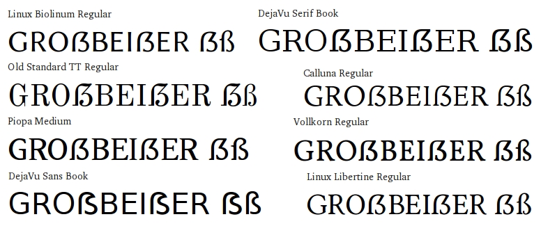
@Paul: Well, afaiu this will then released in March 2011? Will there be a PPA to get glyph additions faster than waiting till Ubuntu 11.04?
Thanks?